
 USD
USD GBP
GBP
 EUR
EUR
Exploring Your Ideal Garden: These 9 Design Examples Will Inspire You
Jul 12, 2025
As the visual focus of the bedroom, the color selection of the wardrobe directly affects the spatial atmosphere and living experience. In 2025, the home design field presents a dual trend of "light tones return" and "earth tones rise". Combining color psychology and space planning principles, this article will analyze how to create a wardrobe color scheme that is both atmospheric and aesthetically valuable from three dimensions: popular trends, matching skills, and psychological influence.
1. Trendy trend of wardrobe colors in 2025
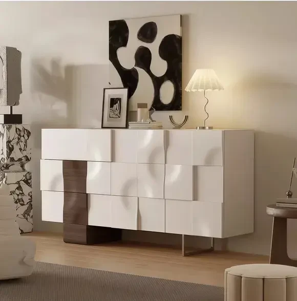
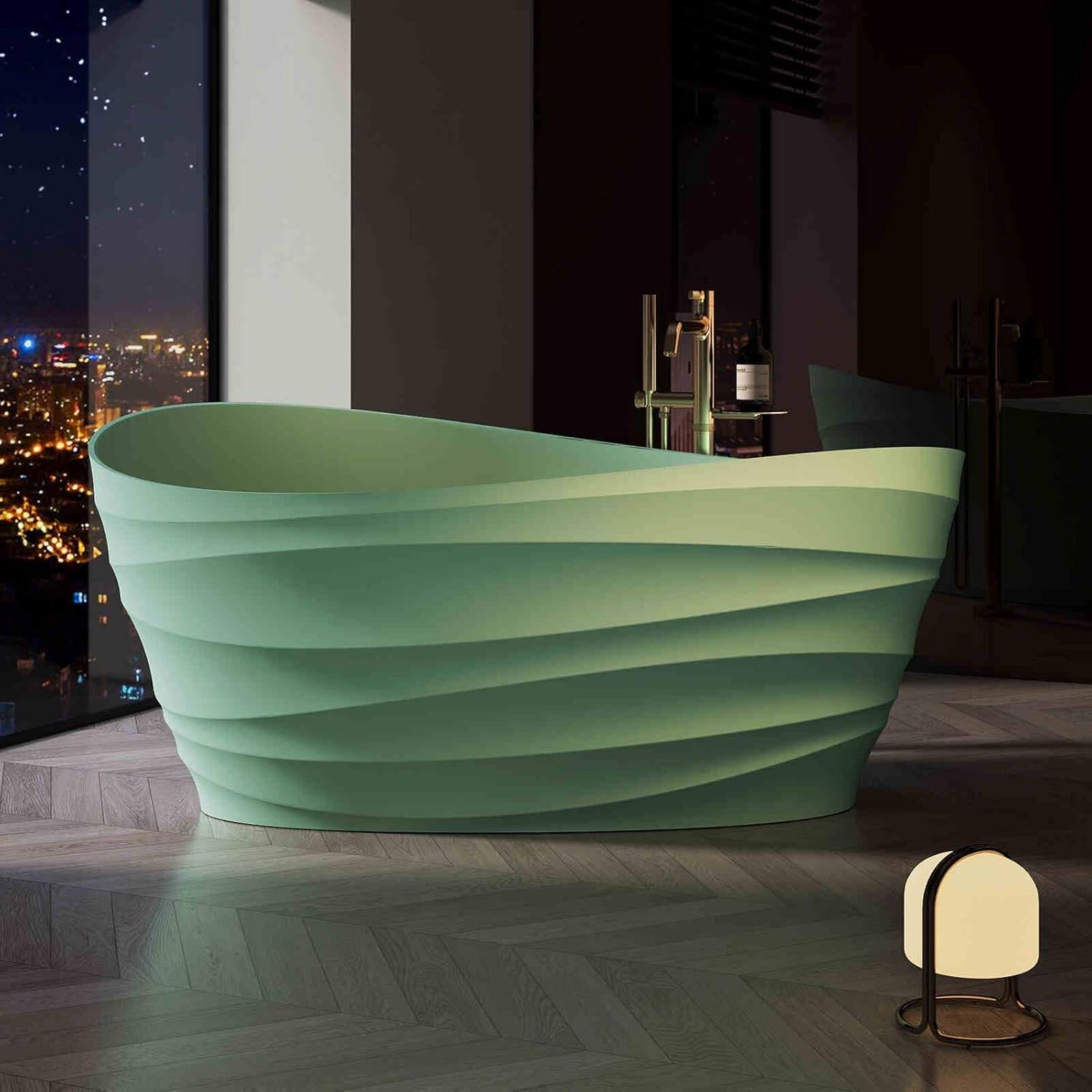
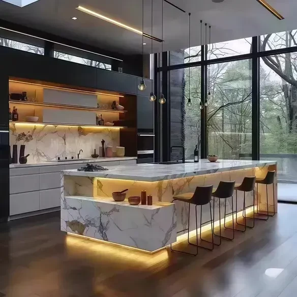
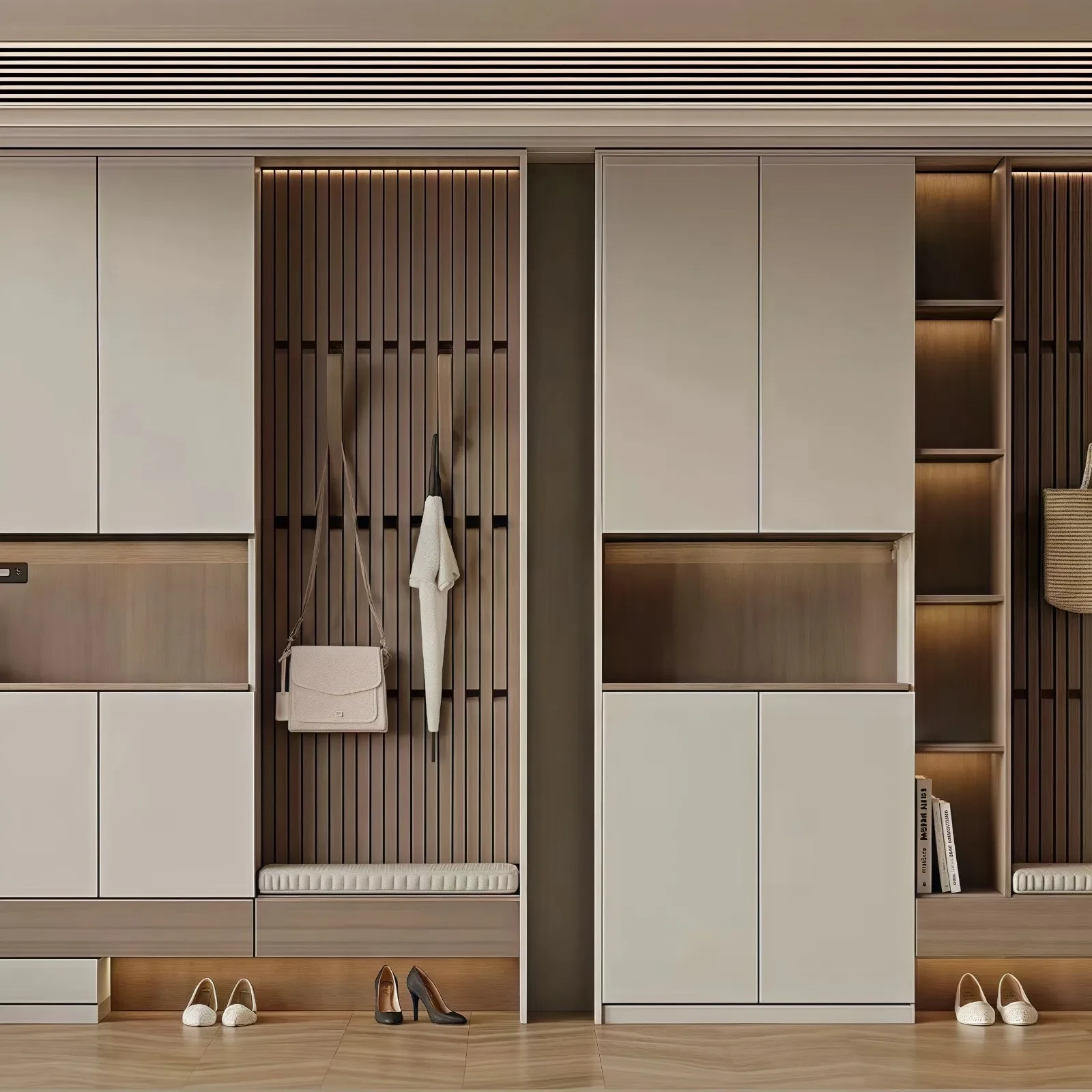
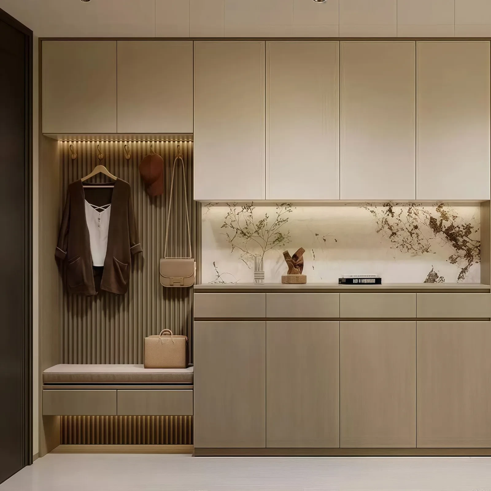
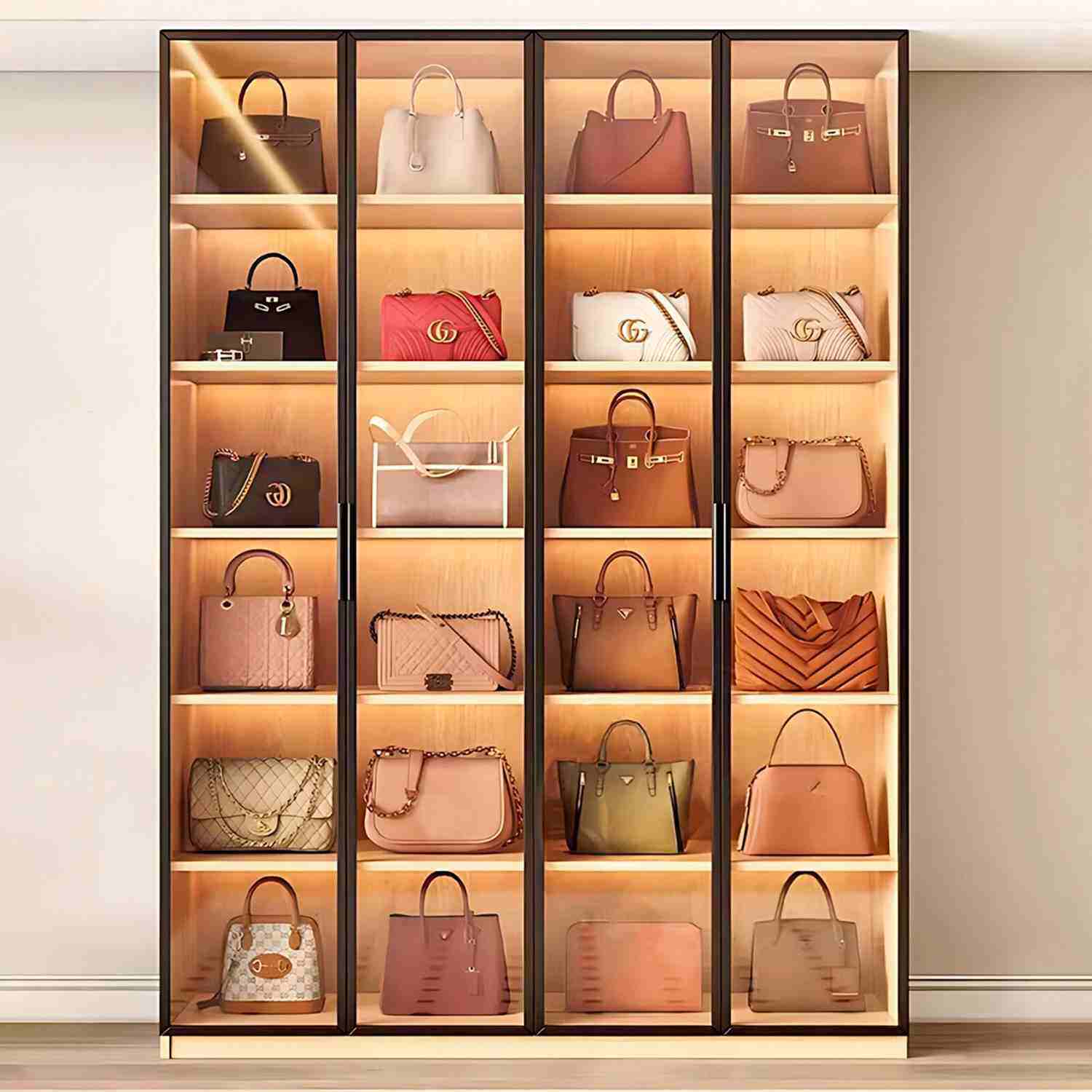
The 2025 annual report released by the authoritative color organization PANTONE shows that "earth tones" will become the core color system in the home furnishing field. Naturally derived colors such as golden palm, sand gold green, and wild fern green create a calm and vibrant visual effect through low saturation and warm texture. This type of color is particularly suitable for popular styles such as modern simplicity and wabi-sabi style. For example, the use of golden palm cabinets with matte black metal handles can not only highlight the texture of the material, but also avoid color overload.
In the light color camp, the combination of "diamond white + meridian gray" continues to lead the customization market. Data from a certain platform shows that the search volume of this color scheme increased by 47% year-on-year in the first quarter of 2025. Its advantages are: 1) creating visual comfort through the balance of warm and cold tones; 2) strong compatibility with materials such as wooden floors and rock slab countertops; 3) a small space looks larger, and the use of bedrooms below 10 square meters can increase the sense of space by more than 30%.
2. Analysis of high-end color matching rules
Principle of unity
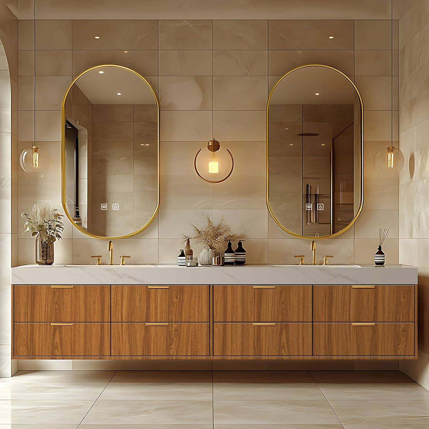
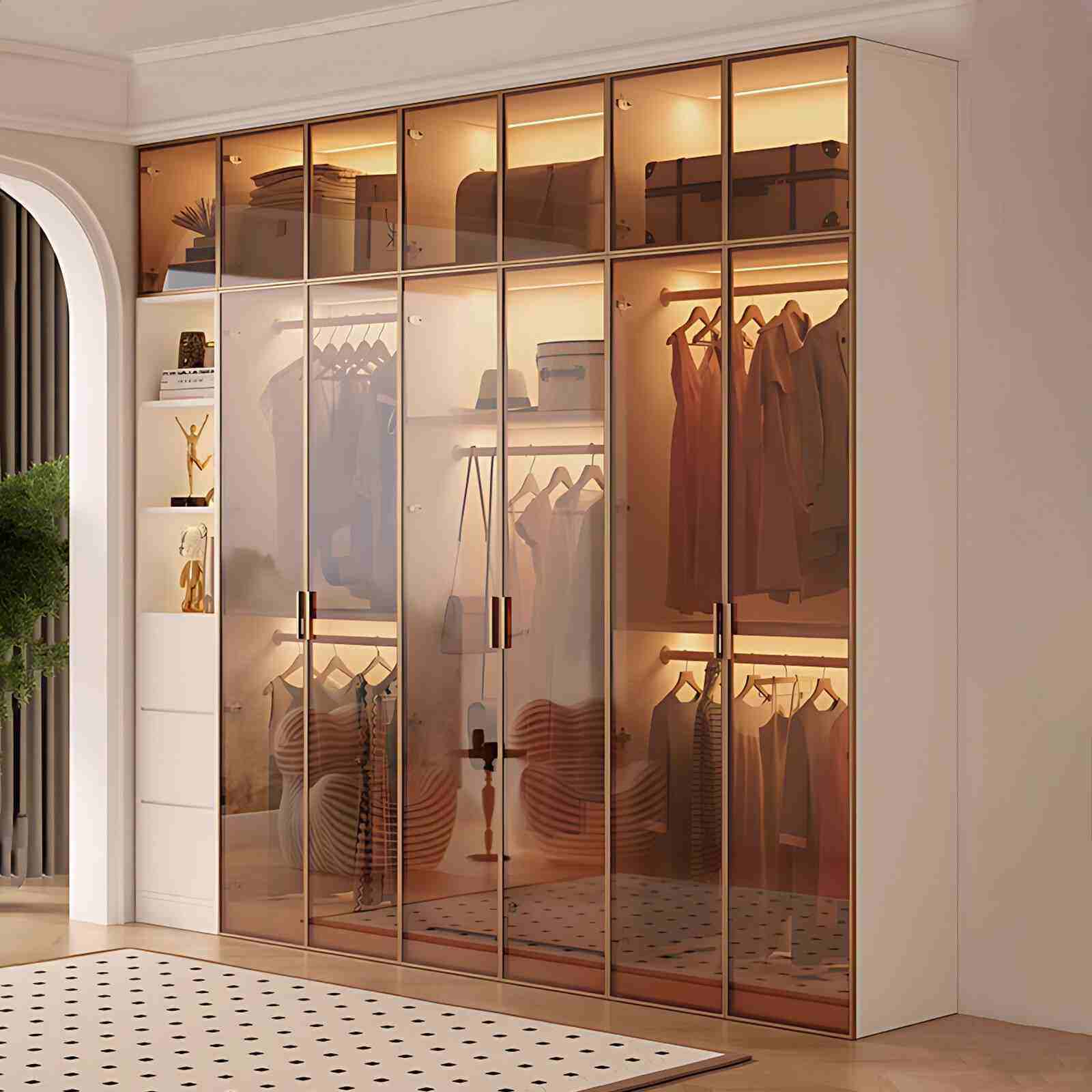
The cabinet doors, light surfaces, and edge strips must maintain consistent colors. A comparative experiment by a design agency showed that the visual clutter of wardrobes with more than 3 color blocks increased by 62%. It is recommended to use the "6:3:1 golden ratio" - the background color (wall/floor) accounts for 60%, the main color (cabinet body) accounts for 30%, and the decorative color (handle/open grid) accounts for 10%. For example, the London fog cabinet body is matched with an amber Changhong glass door, which not only maintains integrity, but also adds layers through material contrast.
Style adaptation strategy
Modern minimalist style: give priority to the combination of MF0025 apricot gray + khaki, with a handleless design to enhance the sense of spatial lines
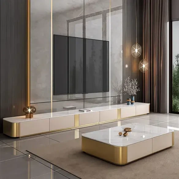
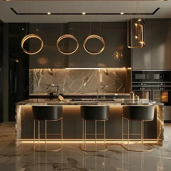
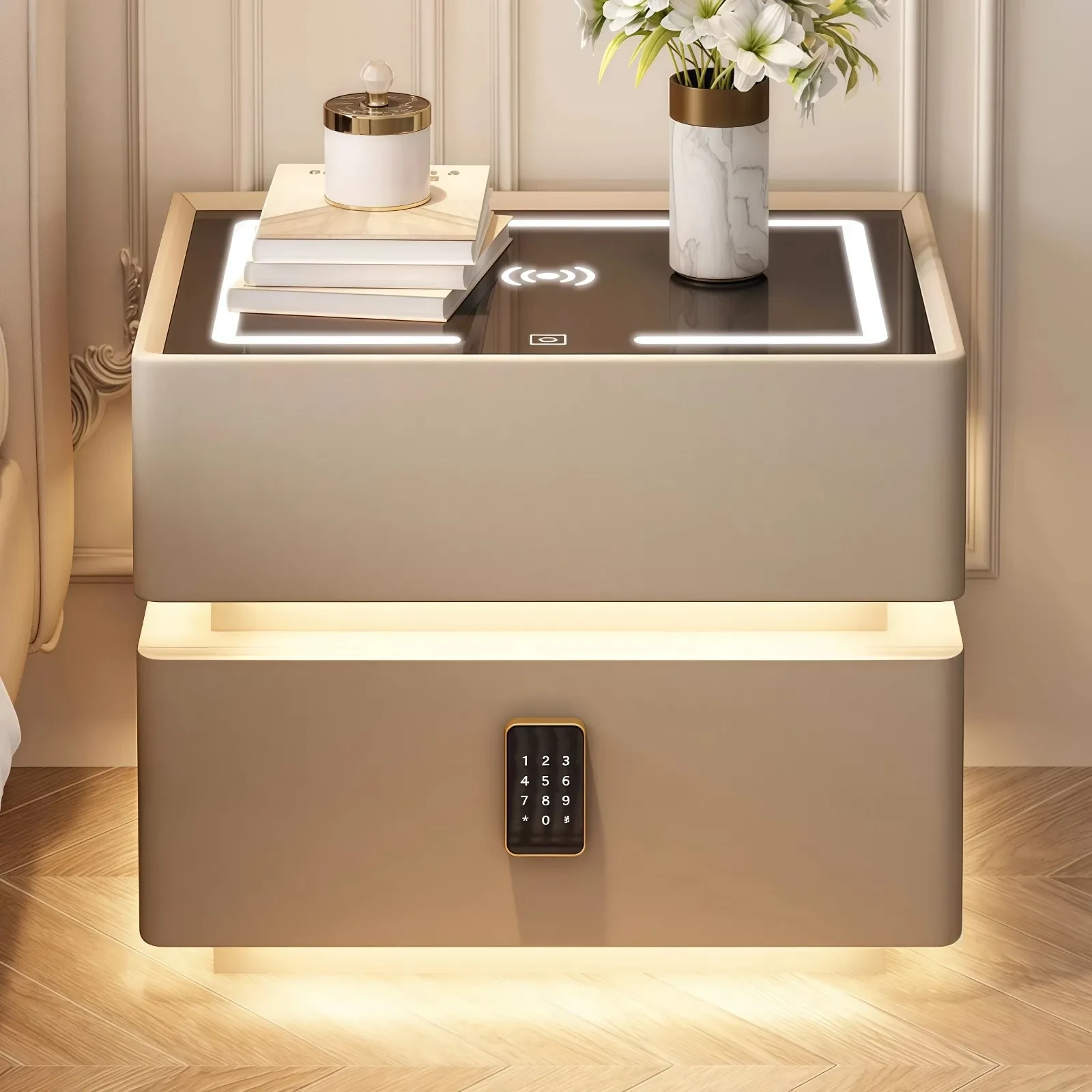
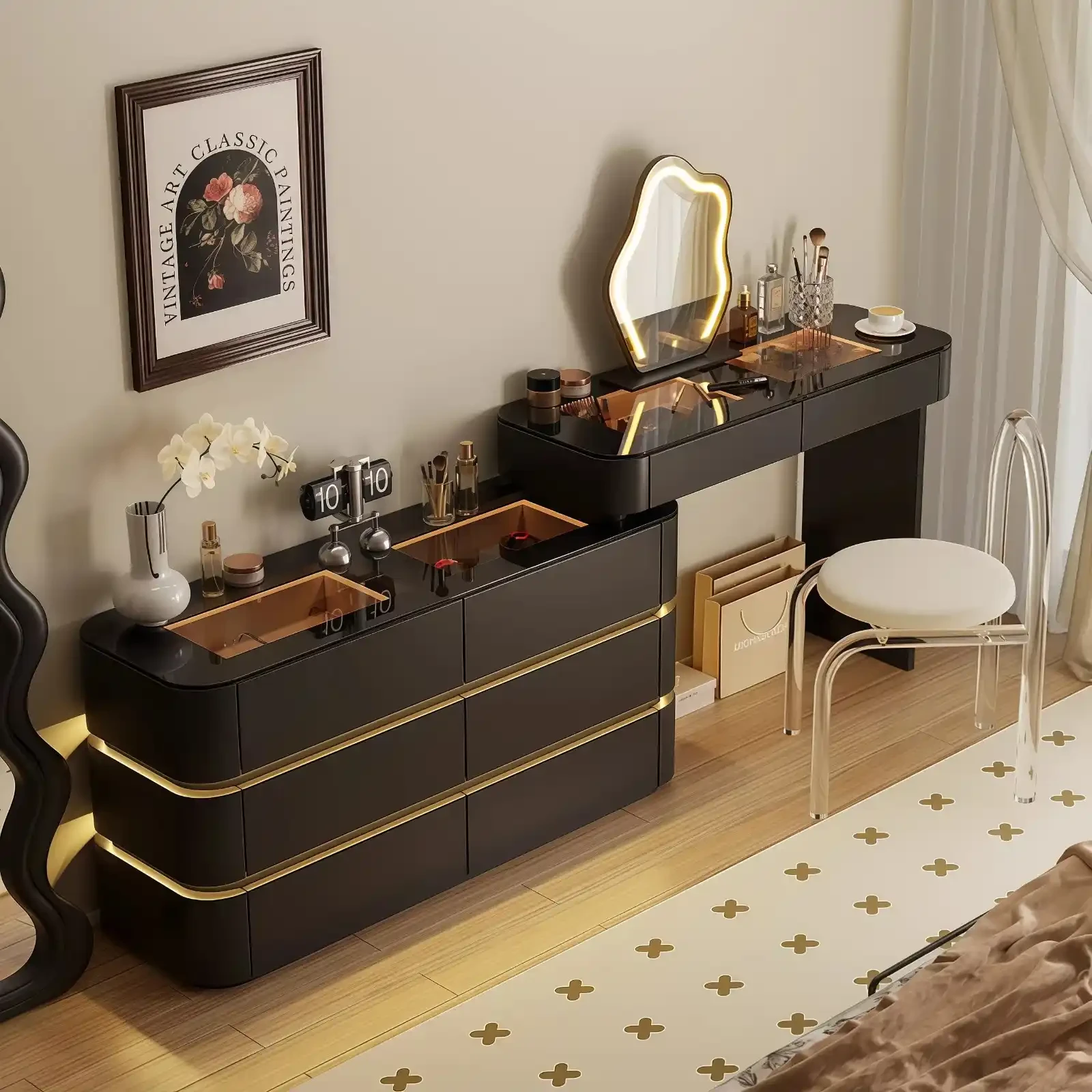
Light luxury style: Blake Brown cabinets are inlaid with metal lines, and are matched with an intelligent light strip system to enhance refinement
Nordic style: Ru kiln-colored cabinet doors are matched with log-colored drawer panels to create a natural healing atmosphere
Light and shadow magic application
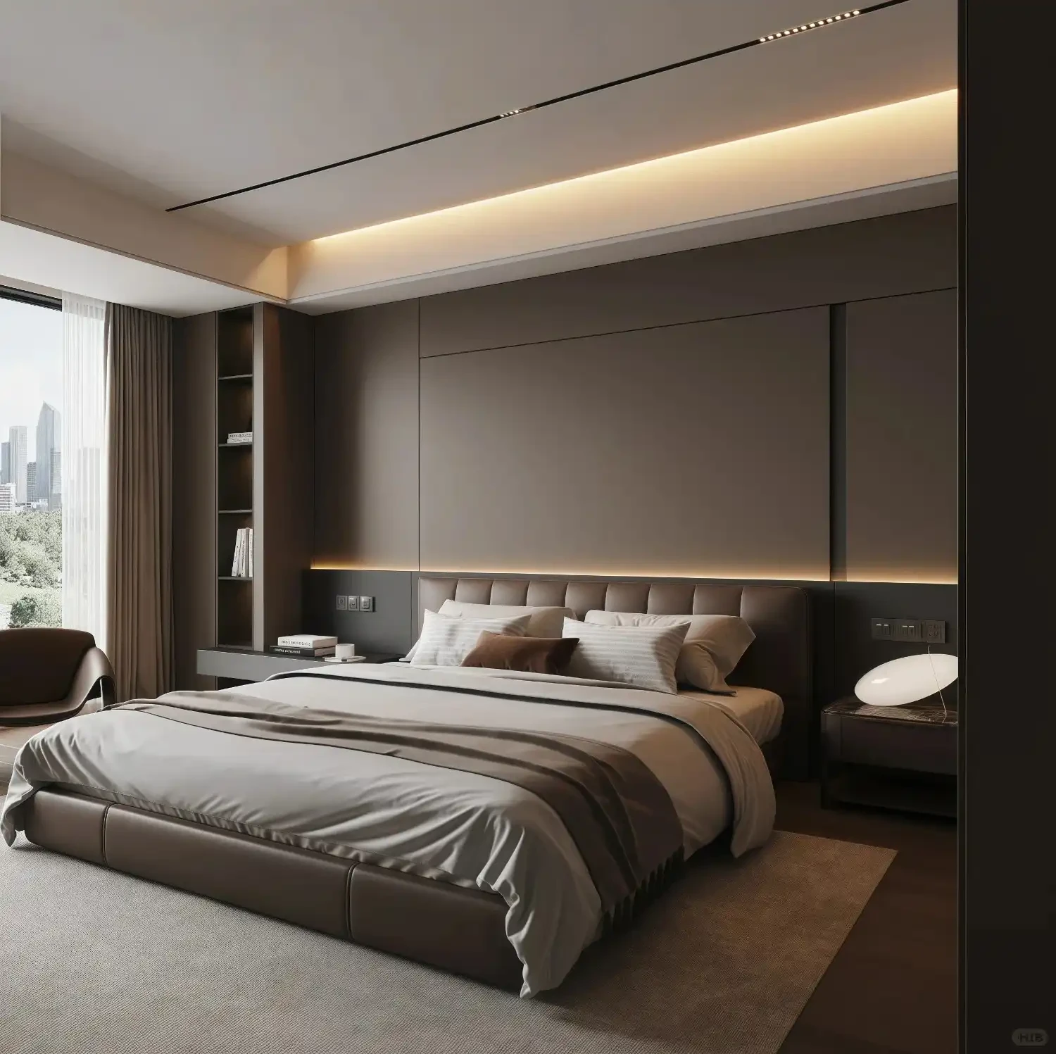
For north-facing bedrooms with sufficient natural light, dark colors such as MF0184 Blake Brown can be tried. It has been tested that this color can present a texture change similar to satin under sufficient light. The dark hall and bedroom need to follow the principle of "light color brightening". In one case, the MF0008 cocoa egg milk cabinet is used with a mirror reflector to increase the brightness of the space by 40%.
3. Practice of color psychology in space design
The impact of color on psychology has cultural commonality:
Blue series (MF0551 Haze Blue) can reduce heart rate by 4-7 times/minute, suitable for bedrooms of high-pressure people
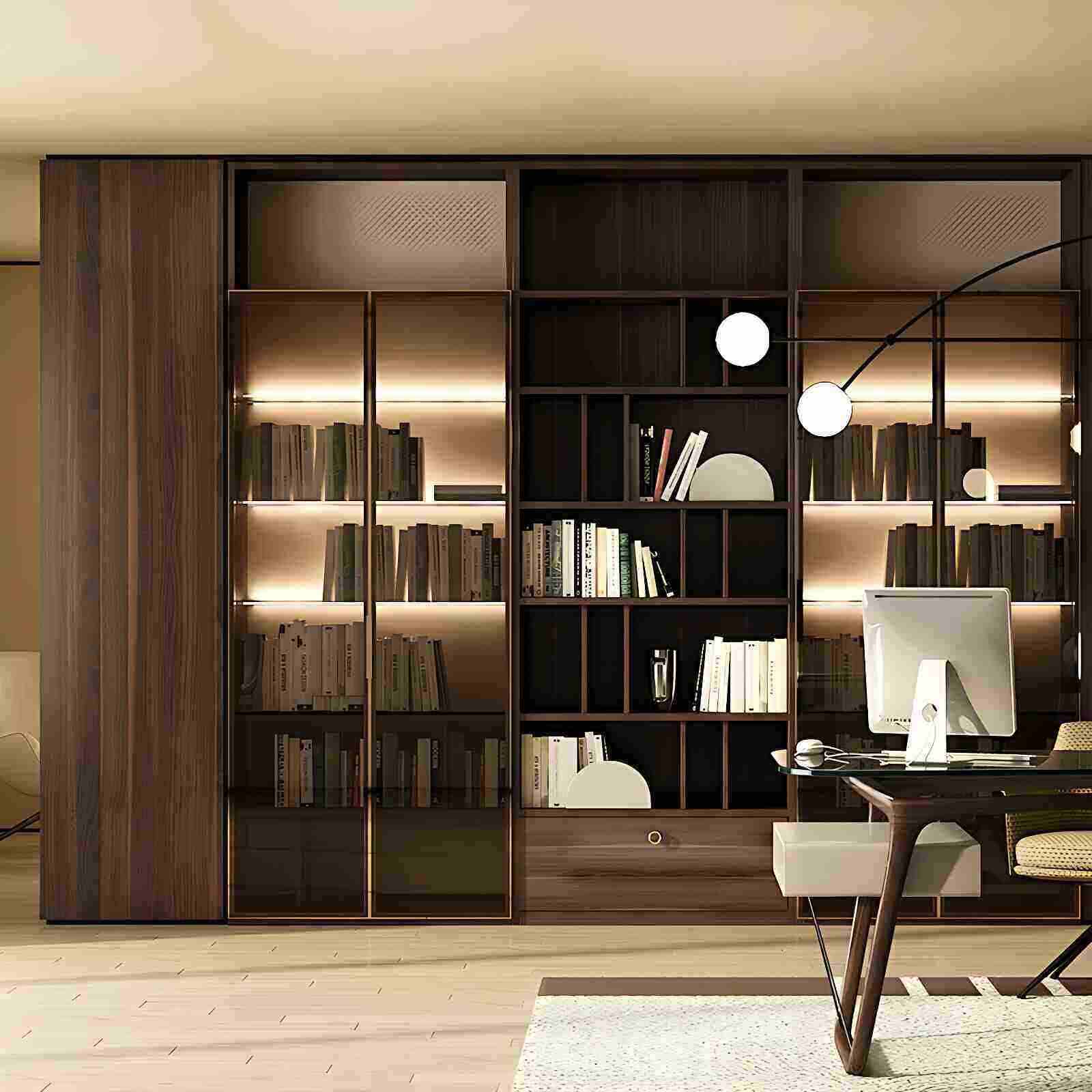
Green series (MF0478 London Fog) can relieve visual fatigue, and can improve concentration by 25% when used in study wardrobes
Yellow series should be used with caution. Bright yellow exceeding 15% can cause anxiety, and it is recommended to be used as an open grid embellishment color
Color schemes for special groups:
Children's room: Use 70% white + 30% low-saturation colors (light dogwood pink/baby blue) to promote creativity
Elderly room: Recommended beige + light gray blue combination, tested to improve sleep quality by 18%
Couple room: Burgundy red wine cabinet with warm light strip to create a romantic atmosphere
4. Advanced matching skills and pitfall avoidance guide
Material mix and match rules
The combination of matte cabinet + high-gloss door panel can enhance the texture level, but attention should be paid to color connection. An experiment shows that the brightness difference between dark cabinets and light door panels needs to be controlled within 30%, otherwise it is easy to produce a sense of discontinuity.
Color transition techniques
When the color difference between the wall and the cabinet is too large, it can be buffered in the following ways:
Add a 15-20cm wide transition color waistline
Use a gradient glass door design
Place decorative paintings/carpets in the same color system
Classic pit avoidance formula
Carefully choose pure black cabinets (dirty index ★★★★★)
Avoid the conflict between cold and warm colors (such as dark red cabinets + mint green walls)
Small space stays away from high-saturation colors (space compression increases by more than 50%)
Subscribe To Our Newsletter
You Can Get The News Of Our Products
SIGN UP
Payment Methods