
 USD
USD
 GBP
GBP
 EUR
EUR
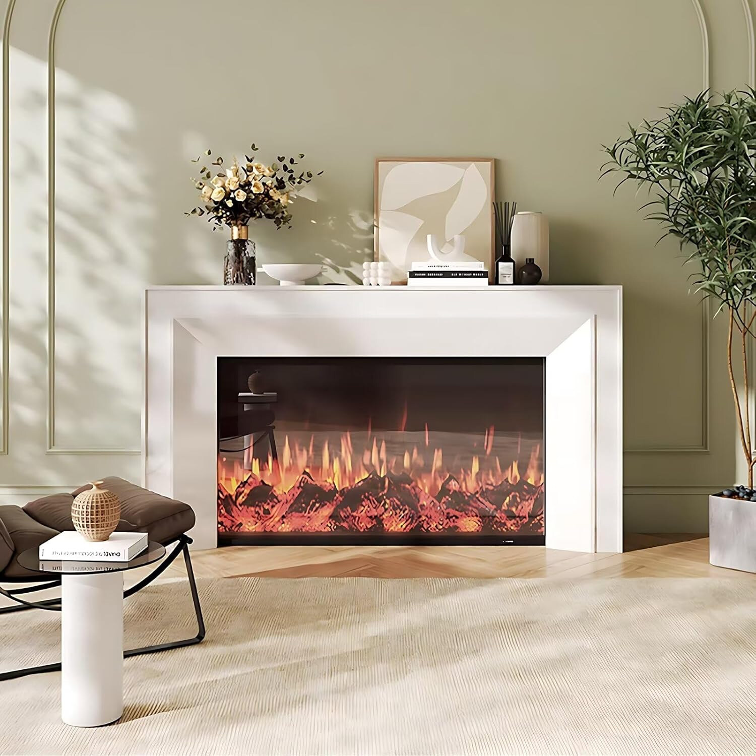
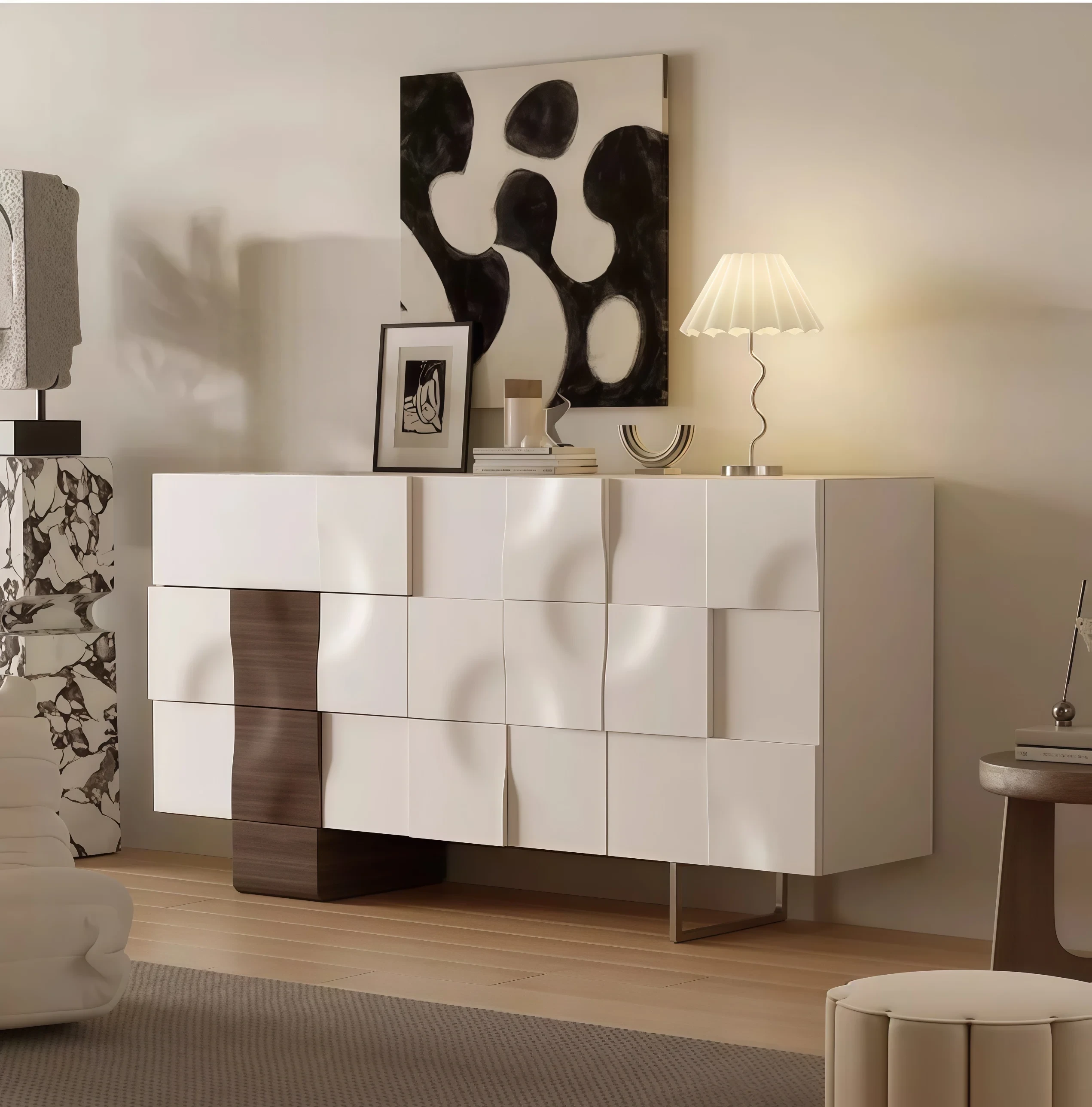
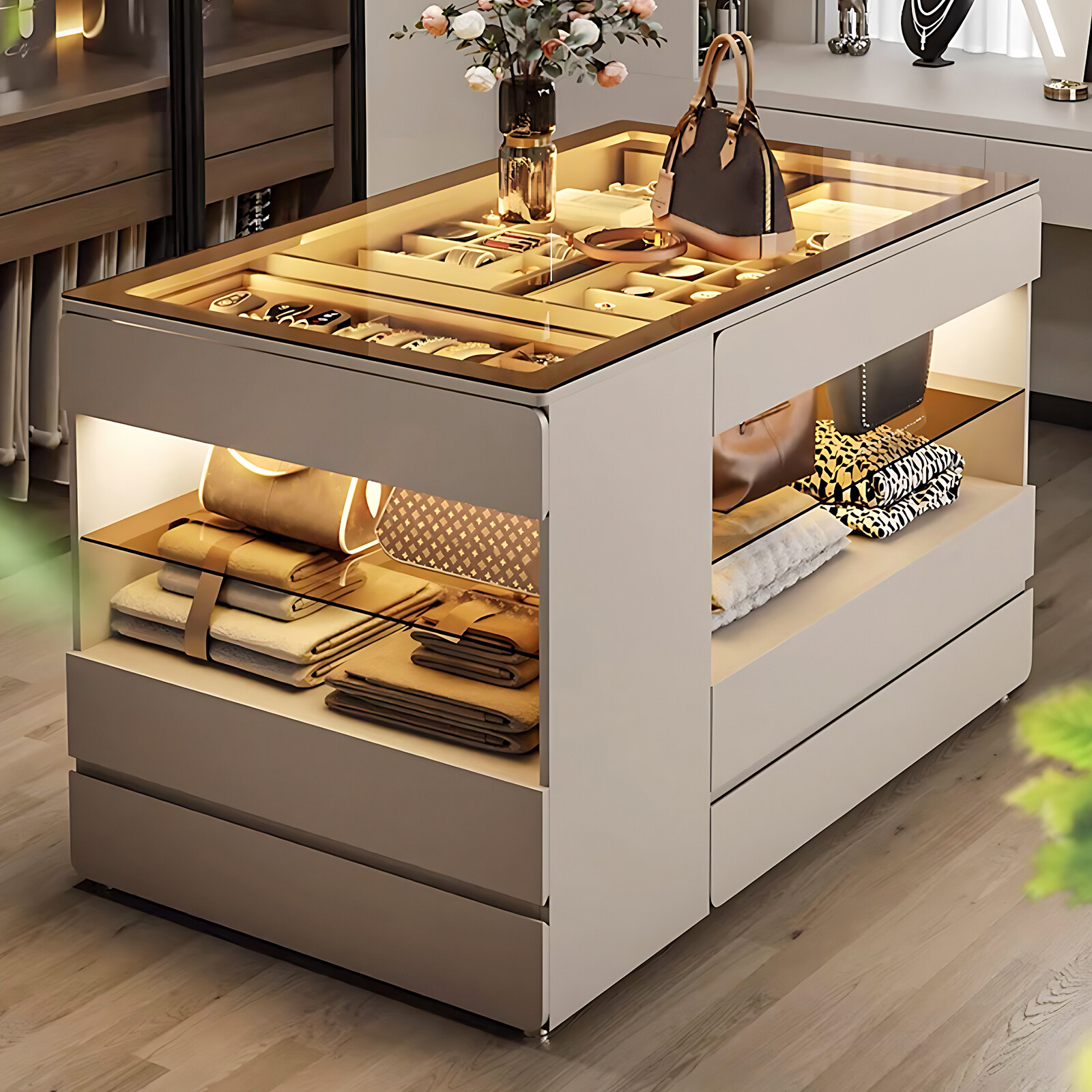
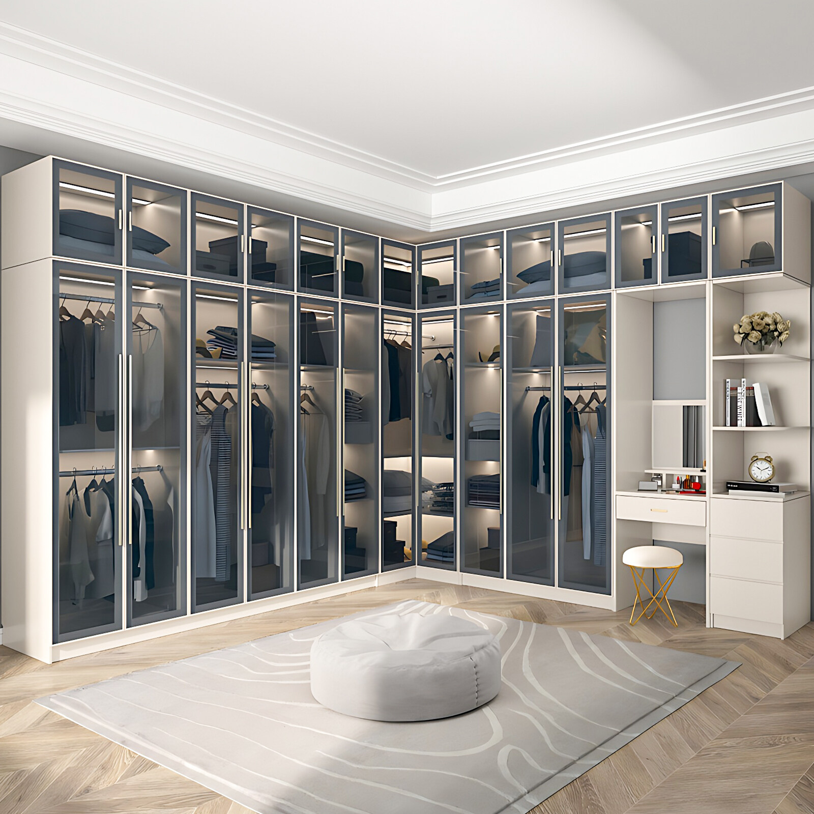
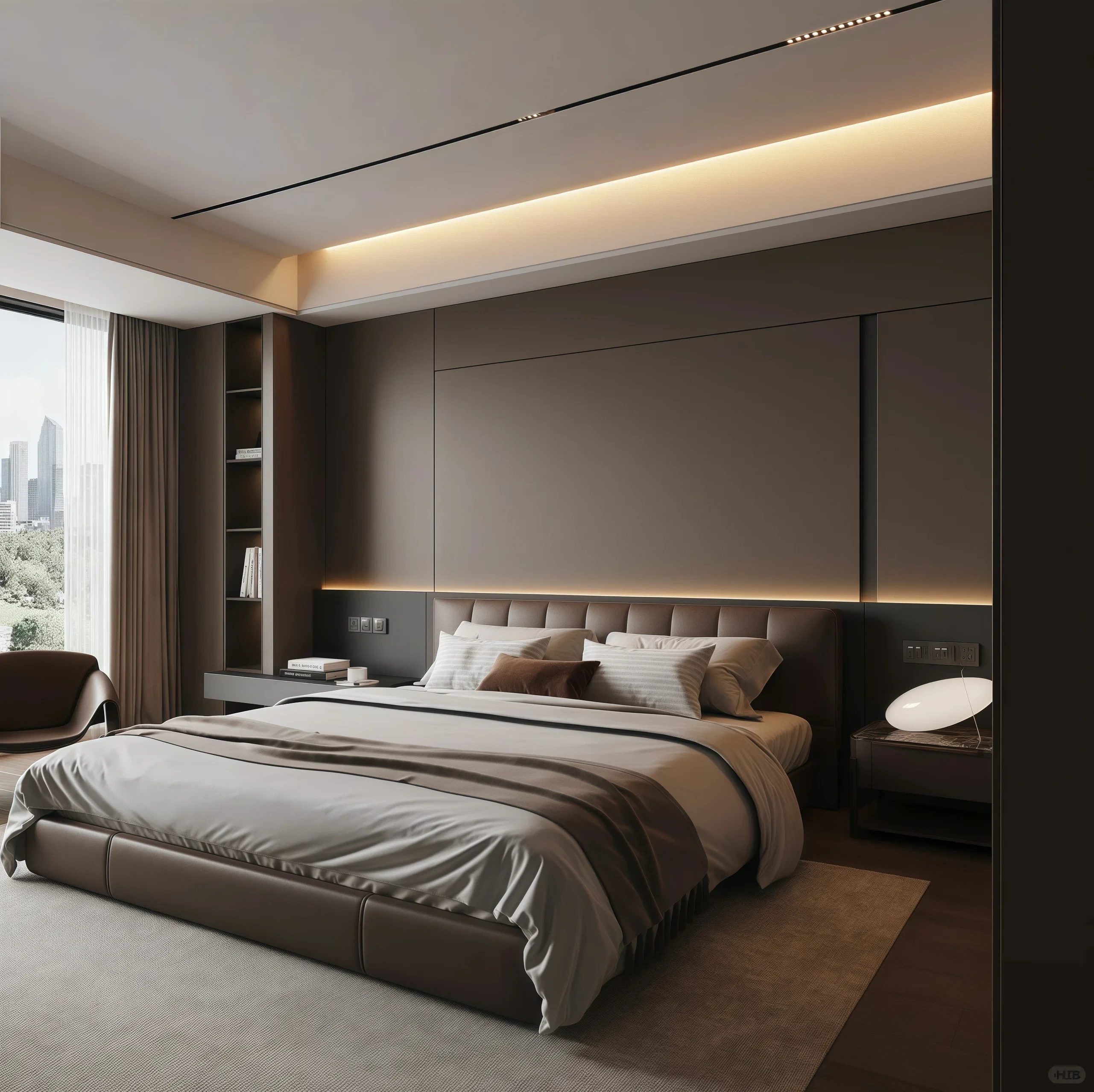
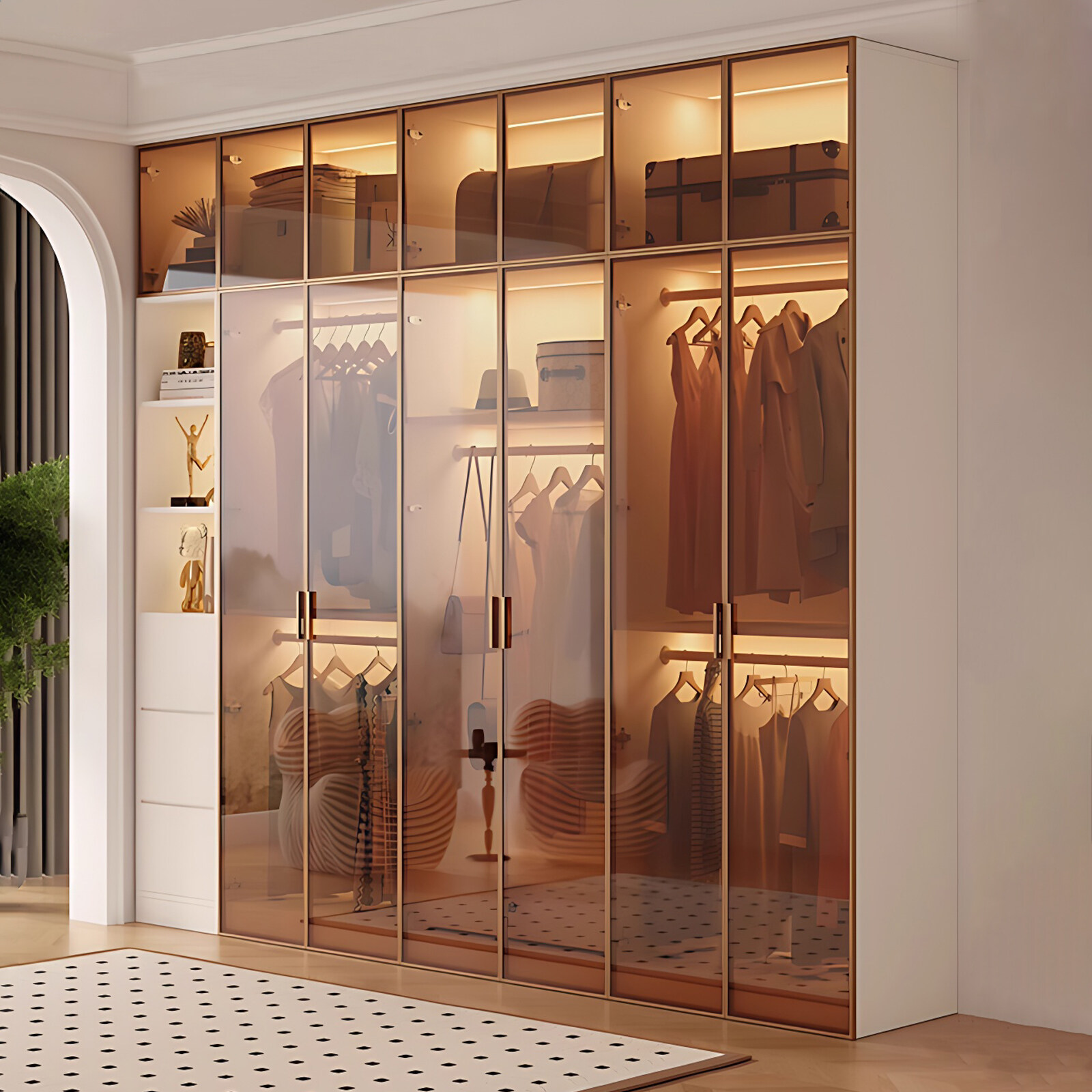
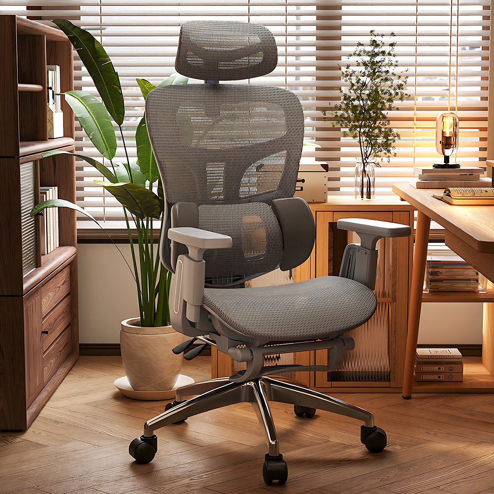
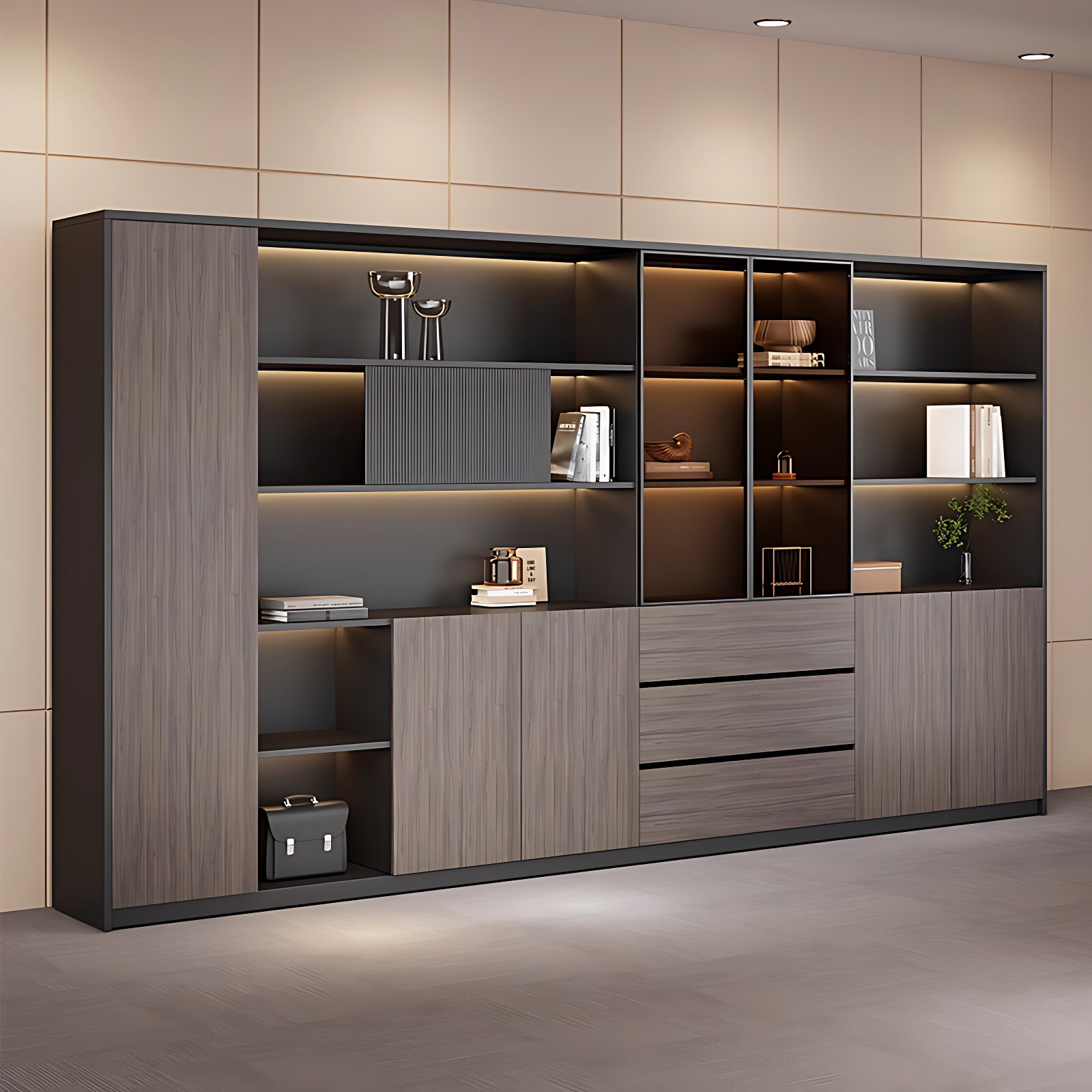
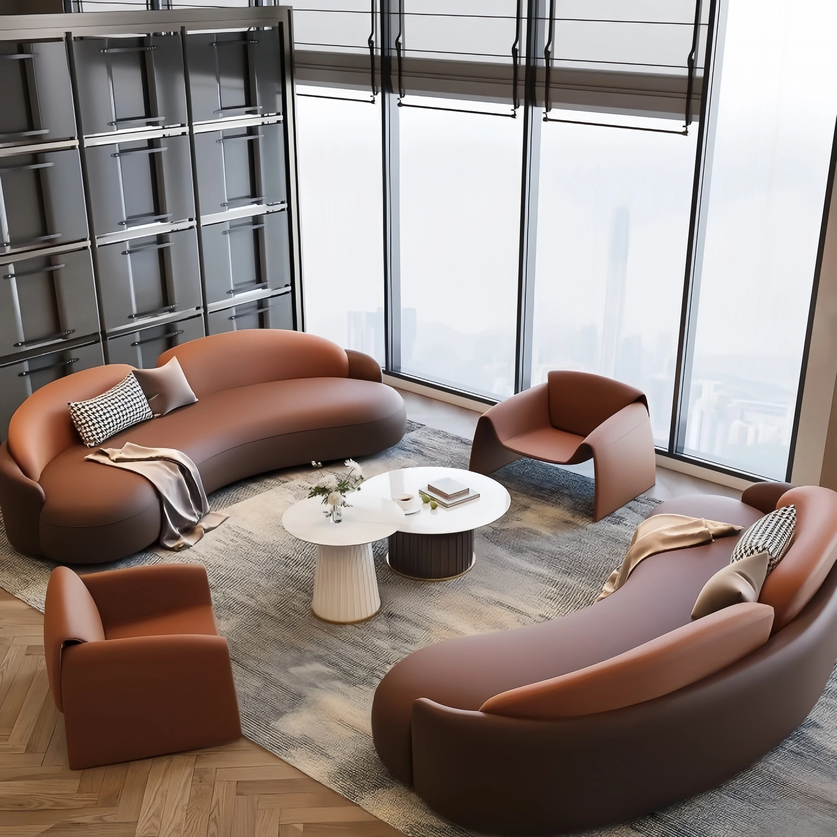


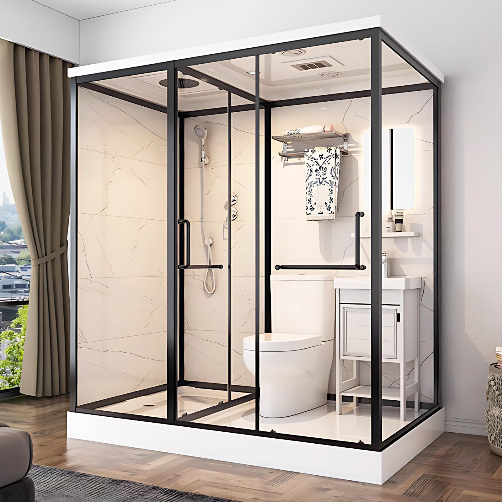

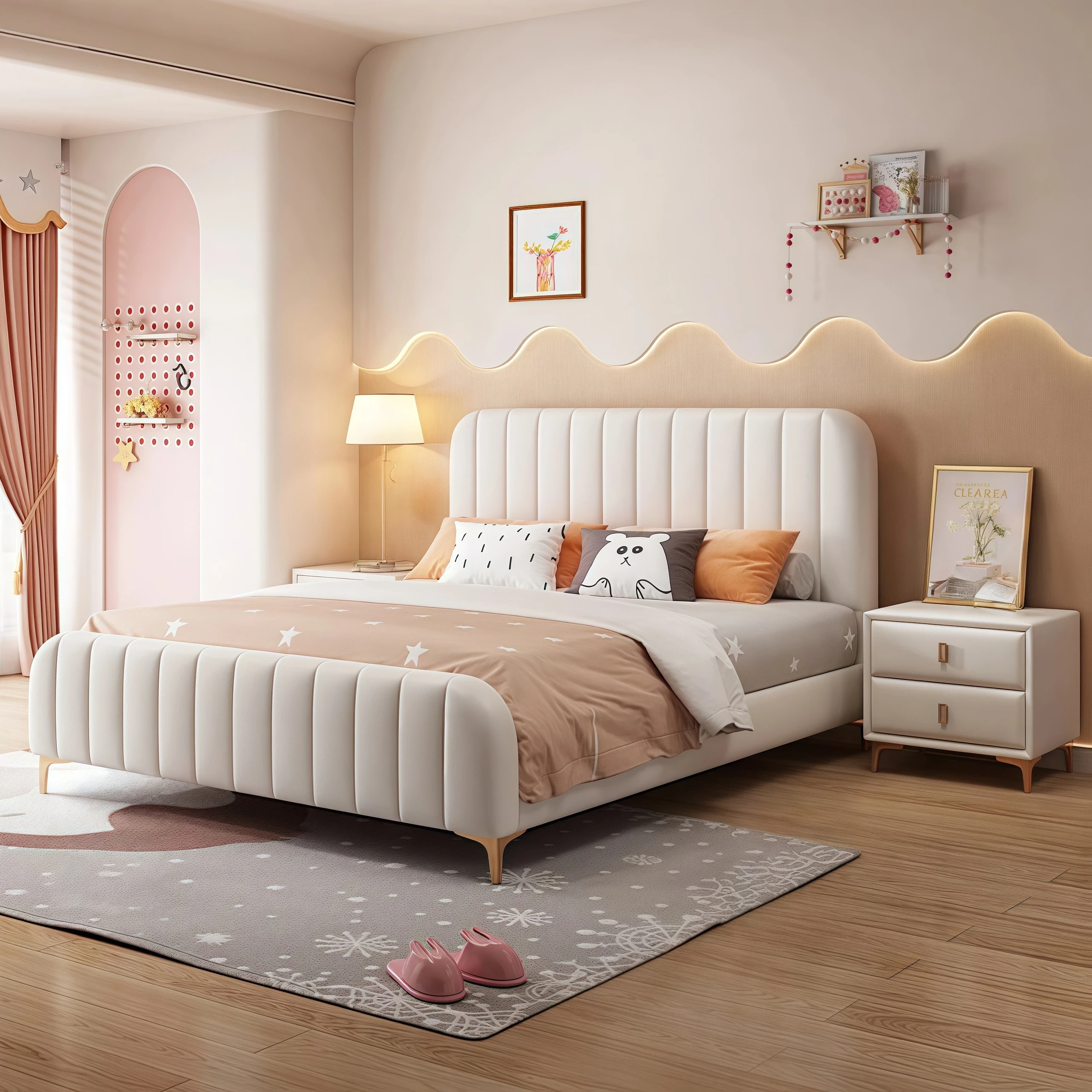
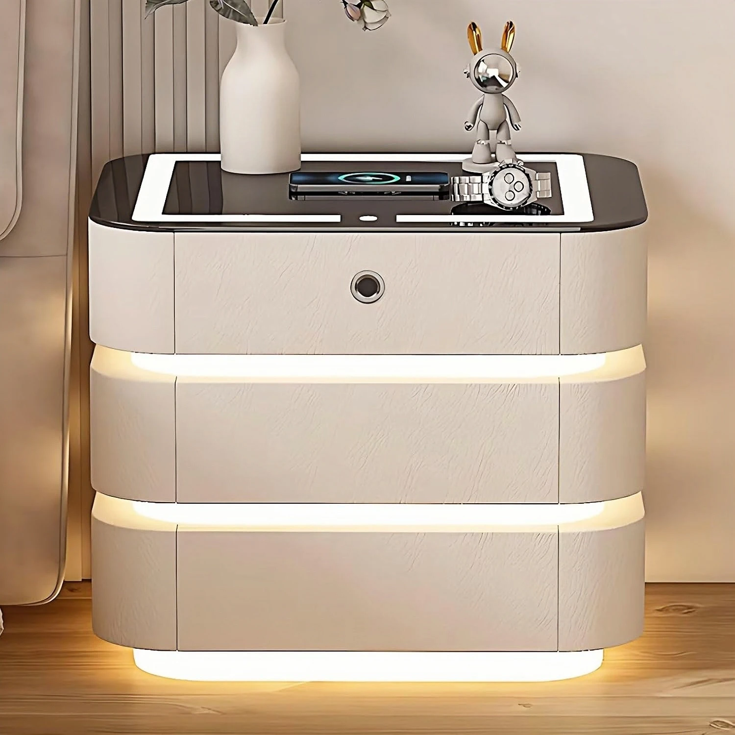
Warmth is the most charming thing about home. The naturalness and ease flowing in life, accompanied by rhythmic ripples and waves, is like a precipitation of time and a kind of nature's mercy. It is the life that everyone yearns for.
Today, we will follow the designer's footsteps and enter the world of Canadian maple, carefully interpreting its color characteristics, matching ideas, and the effects of space application.
CHARACTERISTIC
Features
The color of the wood itself is truly restored, and the semi-mountain pattern design is also extremely simple, giving the space a simple and fresh artistic conception and highlighting the eternal warmth.
INTRODUCTION OF DESIGN AND COLOR
STYLE TAGS
Style Tags
Chinese style, European style and Japanese style
Simple, fresh and full of Zen
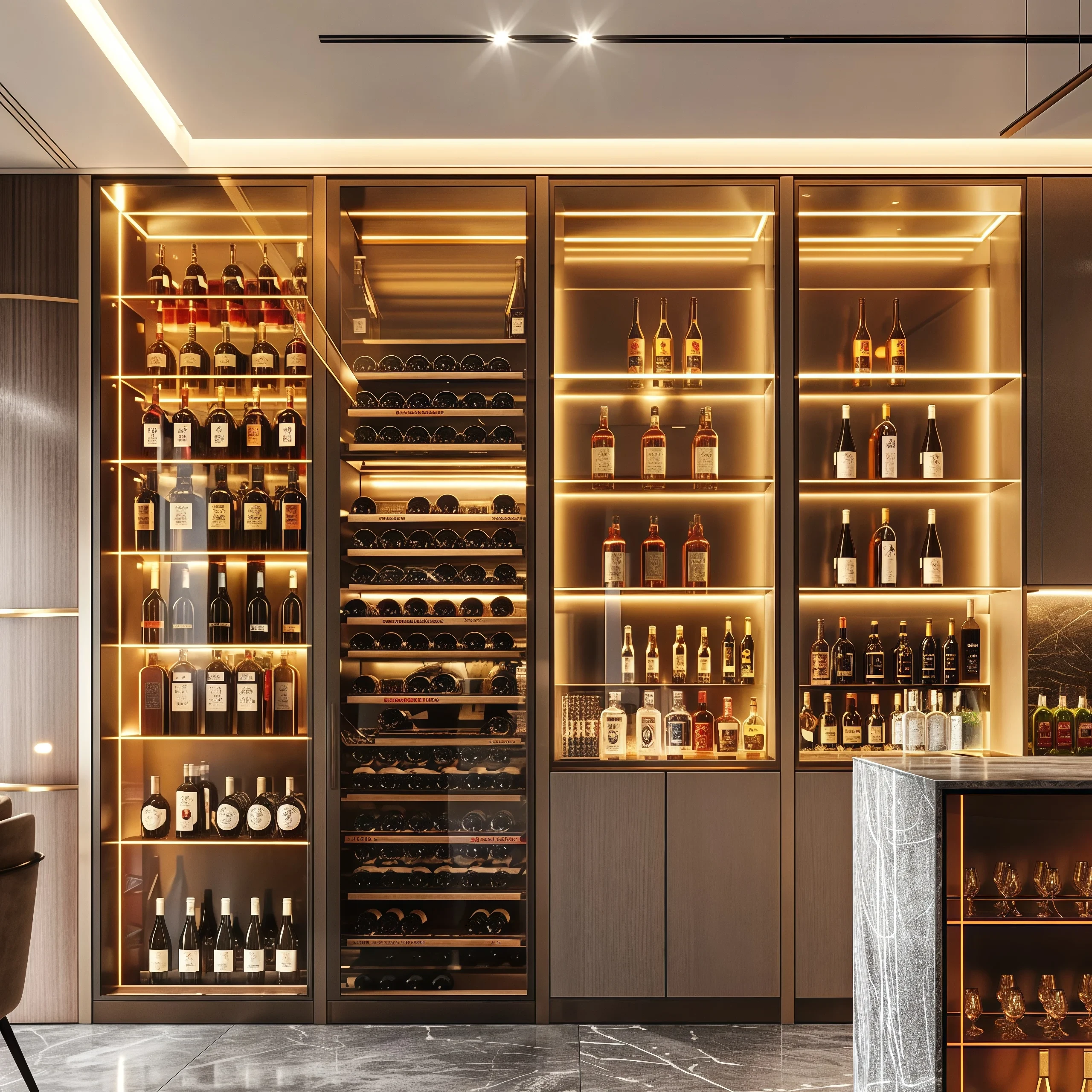
COLLOCATION
Matching
Linen White/Canadian Maple/Delft Blue/Empire Yellow
Wood color collides with white
Classic and timeless
Paired with warm downlights
The whole space highlights the eternal warmth
Designer says
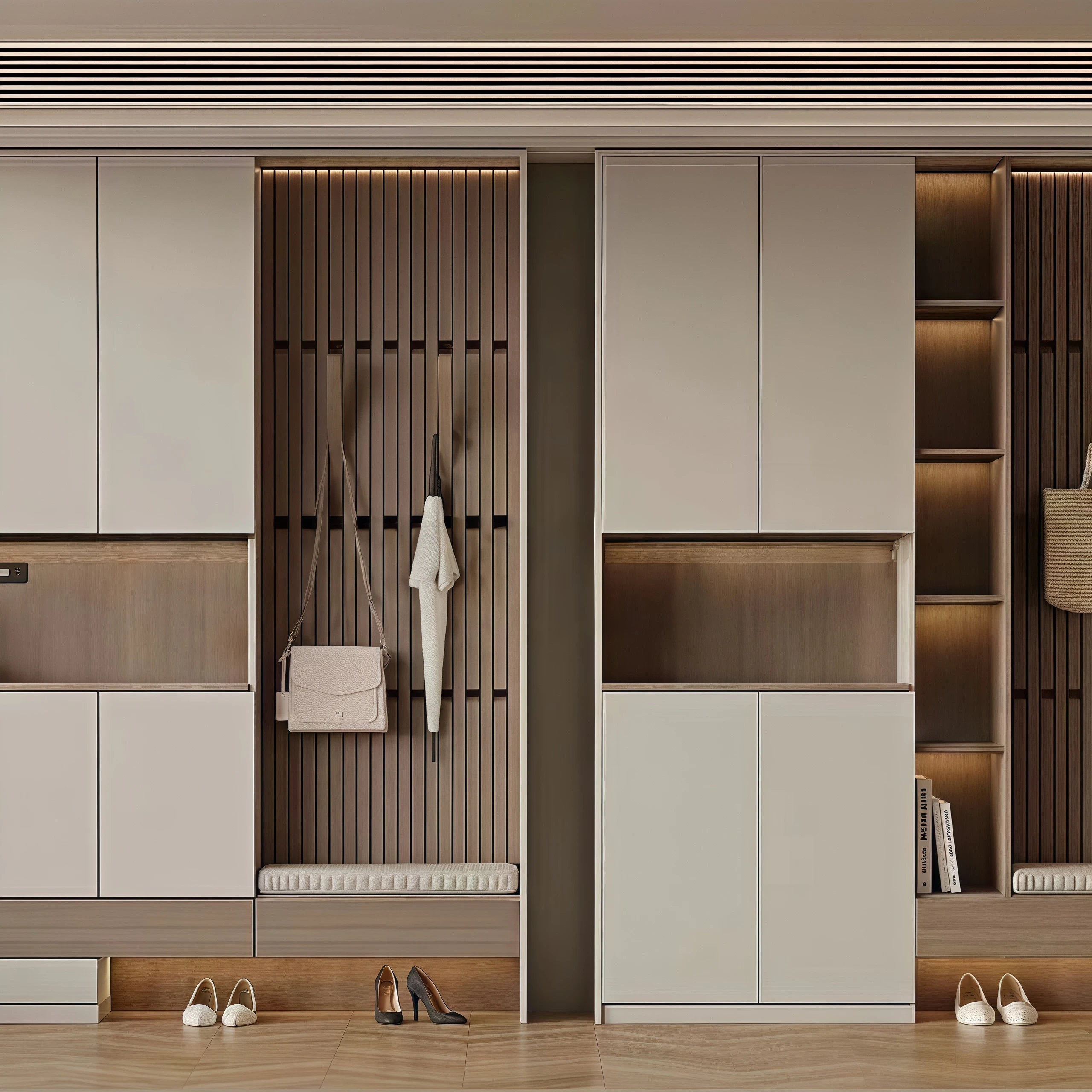
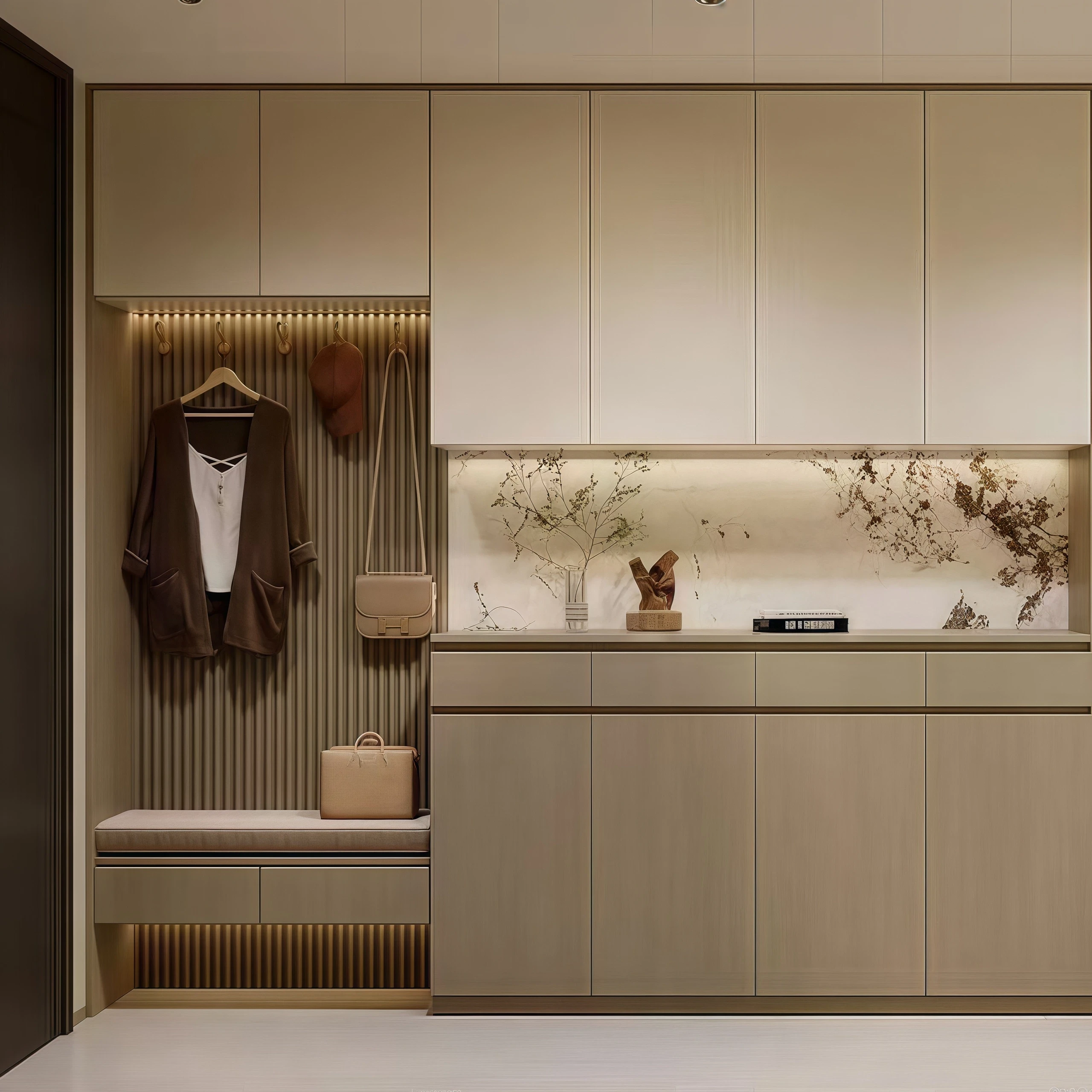
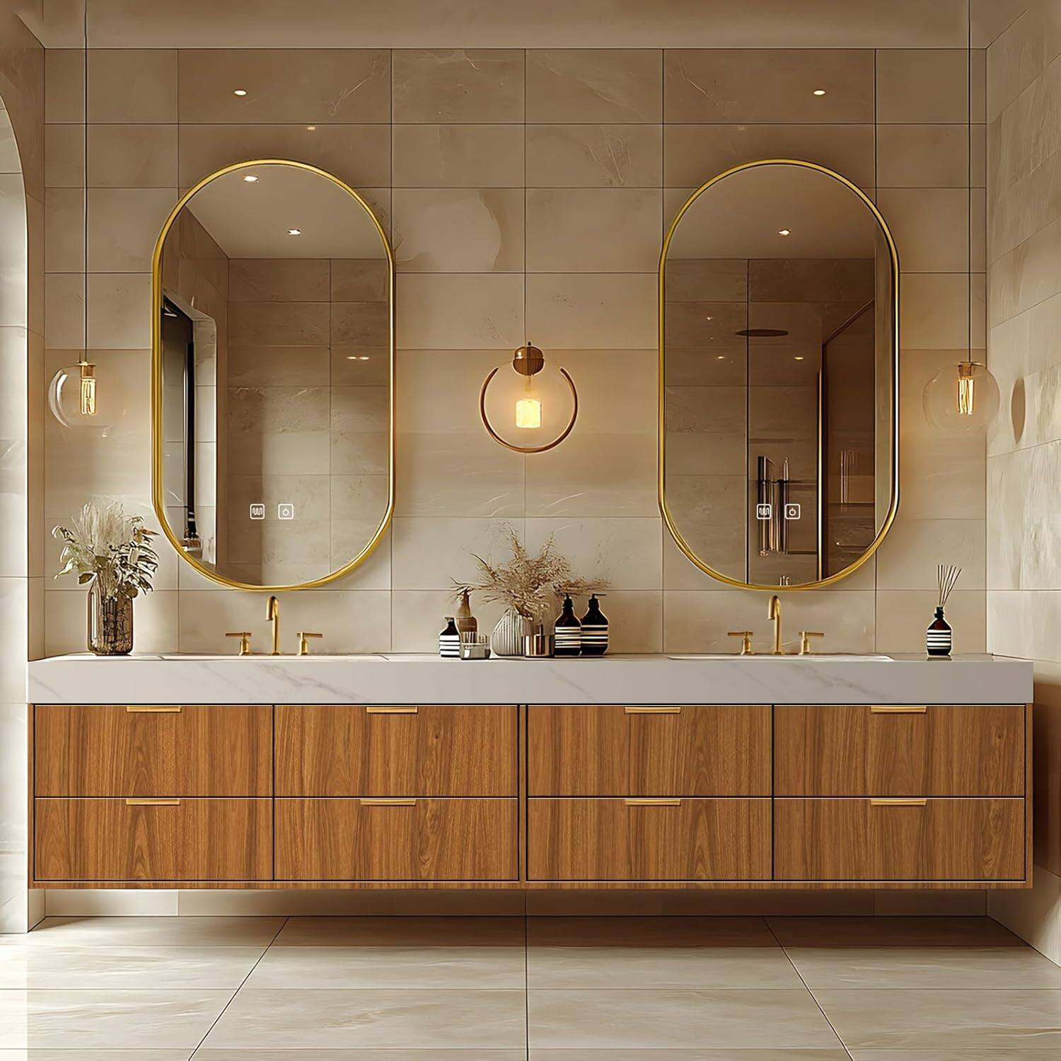
Canadian Maple X White
(Linen White, Lilac White, Bright White, etc.)
Canadian maple's pure, natural color creates a refreshing and natural experience. Its irregular, semi-mountainous grain evokes a sense of Zen and imagination. Paired with white accents, such as Lilac and Linen, it exudes purity and simplicity, creating a sense of relaxation and comfort.
In design, designers can adjust the different proportions between the two to meet consumers' different style needs such as new Chinese style, modern style, minimalist style, etc., which is fashionable, versatile and beautiful.
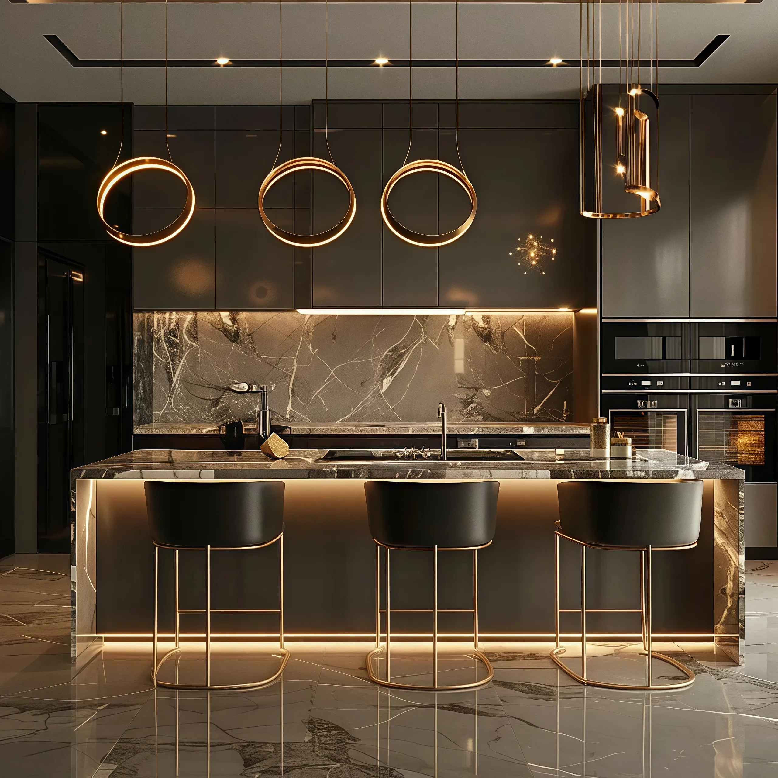
Canadian Maple X Color Tone
(Delft Blue, Imperial Yellow, etc.)
In our designs, we often use Canadian maple wood in combination with color. On the one hand, the natural color of the wood is natural, which makes the style more simple and natural. On the other hand, the use of color can effectively avoid the dull feeling of the space, giving it a more lively and relaxed fashion atmosphere. Of course, the proportion of solid colors used is much smaller, and the occasional contrasting color and small details will be the main matching method.
Canadian maple and imperial yellow
Make the space lively and warm
Give the space a warm charm
Canadian maple and Delft blue
It will give the space a little vitality
Full of fashionable artistic atmosphere
Perfect for Nordic style designs